COLOUR AND DECORATING
There is nothing more depressing than living in a home whose colors do nothing to brighten nor lift the energy. Homes should be the place where one feels happy and comfortable. Color is one element in home designing that facilitate and boost vibrancy.It is like a loan or a credit given to off set a bad mortgage.
and vibration
Light plays an important part in the brightening because it works hand in hand with colour. A colour has no values unless exposed to light natural or man made. Having the right colour scheme in your room gives a satisfying , relaxing and soothing effect.
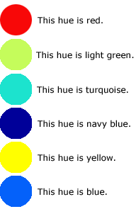
Another name given to colour is hue and that is the natural state of the colour on the colour wheel.
What is colour
This is the result of the breaking down of white light into a single colour element by using a glass prism. These colour elements are red ,orange yellow ,green , blue indigo and violet
How colour is seen.
Colour is seen individually because it is absorbed or reflected by an object, A good example is if a piece of board is covered with green paint it will absorb all the rays of colour in white light except green. This ray is bounced off or reflected off the board and green is seen.
Who use colour.
Every one at sometime may say they have used colour, but there are individuals whose life work revolve around colours
1. The physicist deals with 3 primary colour which are red blue and green. These are the primary colours used in T.V. and photography they are not the same primary colours used by the artist.
2.
The psychologist deals with human response to colour. Red is seen as
stimulating while black is seen as depressing. Fashion designers and
colour consultants stage designers who use lights
All tap into the reservoir of colour knowledge of these three classes of individuals
All tap into the reservoir of colour knowledge of these three classes of individuals
 3.
Artist deal with our response to colour too .They make use of this
information in a different way. The artist could be compared to a
chemist because they work with the mixing of colour pigment they deal
with colour and not light. The primary colours used by artist are red,
yellow and blue, and their secondary are orange, green and purple
3.
Artist deal with our response to colour too .They make use of this
information in a different way. The artist could be compared to a
chemist because they work with the mixing of colour pigment they deal
with colour and not light. The primary colours used by artist are red,
yellow and blue, and their secondary are orange, green and purple
Cool Colors> Green, blue, purple
Cool colors recede into the distance and will give a small room a larger look.
CAUTION: Never use cool colors in a dark room that faces the north! The sunlight will not penetrate the room and so the room will appear cold.Cool colors are good for warm, sunny room. They are good at making SMALL ROOM LOOK LARGE?
CAUTION: Never use cool colors in a dark room that faces the north! The sunlight will not penetrate the room and so the room will appear cold.Cool colors are good for warm, sunny room. They are good at making SMALL ROOM LOOK LARGE?
warm colours> Red, , yellow orange
For rooms that do not get direct sunlight, its best to use warm colors. These will add life and brighten the room. To get a warm,cheerful look and feel, use tints of the warm colors such as pinks, salmons, peaches and soft yellows. These are versatile and good for the living room.
SUNLESS ROOM:
CAUTION: Red, orange and yellow are naturally strong colors and very dominant. To be effective, use as accent colors.
To get a harmonious look, use the opposite colors on the color wheel. This will give a blend of warm and cool colors for rooms that are not too sunny. Blend of how much warm and cool colors to use will depend on how much sunlight enters the room.
Elements of Design Principles of Design
On entering a living room, a living room, ‘invisible welcome sign,’ should be written in the air. Simplicity and skillful arrangement of furniture and color in drapery and walls can influence your happiness and relieve stress after a hard day at work.
Furniture should not be randomly placed around the room as space holders. They should be carefully selected in relation to size, shape and color of other pieces of furniture in the room. Emphasis should be placed on activities that will take place in the room. Example, entertainment, resting, studying, praying.
HARMONY IN THE DÉCOR:
1. Very brightly colored pictures and other wall decorations will not be effective on a brightly colored wall.
2. A room with a dull wall/ background can be brightened when contrasted with colorful rugs, and draperies.
3. Use solid (plain) draperies with patterned walls.
4. Solid drapes can also be used with plain walls but you will need pictures or patterned furniture to make the room ‘lively’.
5. Large furniture should not be placed by the window as it will drown the natural light coming into the room. Large furniture should be placed parallel to the wall while smaller pieces be placed at different angles to create harmony. This will lead the eye around the room in a rhythmical pattern.
Colour has effect on the body and it reacts to colour every day even though many are unaware. Some colours tells
you to relax while some say get up and go .People most times unconsciously react and obey them.
One example is the colours used in a fast food store are usually red and yellow they keep you going. Compare the inside of an airplane, blue green and cream makes you feel calm and safe.
Internationally in regardless to race, language culture, or intelligence people react the same to colours.
Colours are use in symbolism, and also used to tell emotion, You here statements as “cool as ice blue”, “warm as the sunshine,”
“ I saw red”. The colour we love can tell a number of important things about us, whether we are ,calm, aggressive, confident or timid, conservative or rebellious ,contented or ambitious.
However studies show that colour will not indicate your level of intelligence. It is said colour can even tell it one is at risk for a heart attack.
Using Colour Effectively
If one is thinking of brighten the home using colour there are some colour terms one must get accustomed , learn what are they and how to use them. Each primary colour has a complementary colour. That means an object with a certain colour will go well with another of a particular colour
.
Each primary colour has a complementary colour which is produced by mixing the other two primaries. So the complementary colour of blue is orange, a mixture of red and yellow. The complementary colour of red is green a mixture of yellow and blue. The complementary colour would therefore be purple a mixture of red and blue
CONTINUE
The Theory Of Colour
Colour and decorating
How to Manipulate colors
more on decorating ideas
Pastel Colours How To Used
Have fun creating amd colouring and making your own unique patterns
Comments